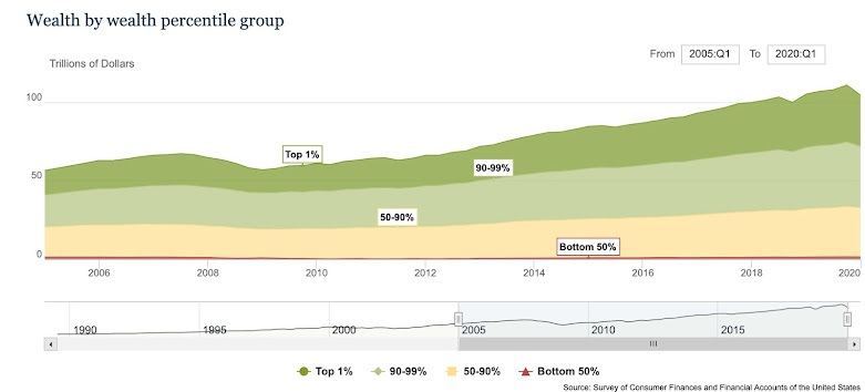
Wealth inequality is much greater than income inequality. This isn't really news, but a vivid visual reminder can be helpful.
The top 20% have about 90% of the wealth.
The next 40% has about 10% of the wealth.
The bottom 40% have net debt.

This chart from the Federal Reserve shows changing shares of net worth over time and breaks up the top 20% somewhat:
This source is slightly inconsistent but puts the cutoffs in more familiar terms.
| Net Worth Percentile | Net Worth |
| 10.0% | -$962.66 |
| 20.0% | $4,798.06 |
| 30.0% | $18,753.84 |
| 40.0% | $49,132.21 |
| 50.0% | $97,225.55 |
| 60.0% | $169,550.64 |
| 70.0% | $279,594.27 |
| 80.0% | $499,263.50 |
| 90.0% | $1,182,390.36 |
| 95.0% | $2,377,985.22 |
| 99.0% | $10,374,030.10 |
From here.


No comments:
Post a Comment